2020
Motion to strengthen branding
One if the greatest fights between client and designers is often 'how big can we make the logo and can we please make the whole app red because that's our brand color'. This challenge has made me look for and gather moments in apps that can take the decorative branding visuals without negatively effecting the usability. Where can branding and illustrations and decorative motion actually bring value without compromising the UX?

Launch screen
The obvious place for branding is always the splash screen. It is only visible when you open an app for the first time or when it has been closed fully and reopened. Therefore, it is okay to give it a few seconds to unfold, since it is not disruptive of the UX. You have the full screen at your disposal, and screens nowadays are huge and borderless, make sure to use the space and let your graphics really go wild.


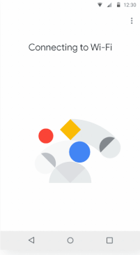
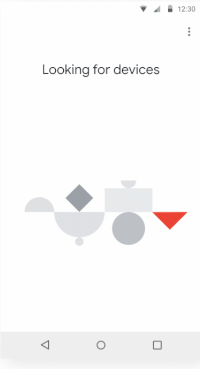
The loader
Most commonly a few dots spinning in a circle. The user is just waiting, and as the seconds pass by, getting closer and closer to tossing the app straight to delete-town. This is a perfect moment to add character and emotions, to strengthen the brand and to entertain the user. Most loaders consist of 3 animations: A loop, a success and a fail animation. If you want to be able to reuse the same animations throughout the app, make sure to keep it as 'general' as possible so it fits many different contexts. Make each animation no more than a few sec, each step should roughly be below 1.5 sec. We never want to make the user wait for an animation to finish.


Hanna Edghill
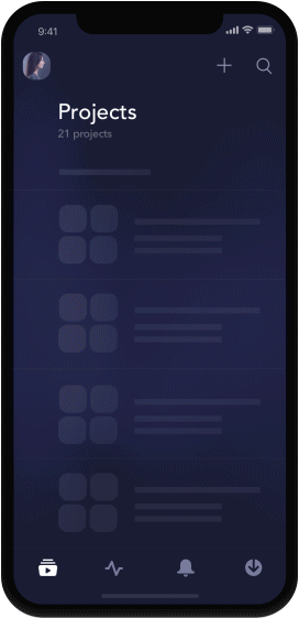
Empty states
Empty states always occur in an app; Lists, states before logging in, feeds, etc. Instead of having just a little info text, add an animation or illustration, bringing life into an otherwise boring screen. Make it abstract enough to use all over the app, it also becomes easier to make slight variations of it.
Oleg Turbaba

Alexa Erkaeva

Sasha Chertok

FedEx
Gun Karlsson
Max Kravchenko
Jakub Antalík
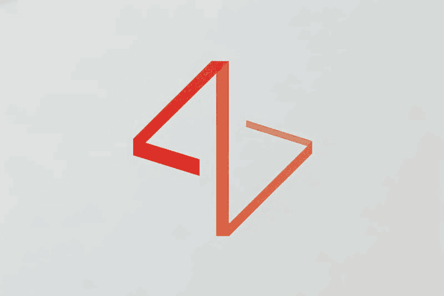
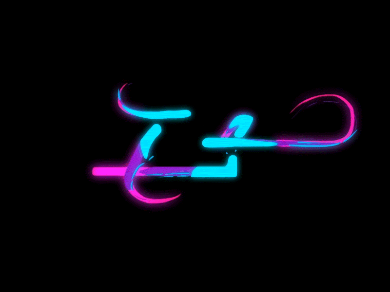
The logotype
Logos are static symbols, it's our imagination and references that brings emotions. We assign them a story, why not help that process on the way with motion? What material is the logotype made out of? What texture does it have? Is it heavy or light? Sticky or soft?

Dynamic content
Dynamic content is the use of videos or GIFs to compliment text. A lot of websites have walls of text and an occasional stock photo from Unsplash. Add a small animation to compliment the text and break it up. Dynamic content animations can vary from full case videos to small GIFs.

